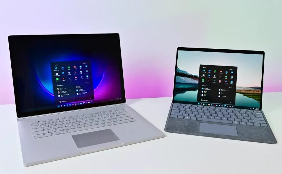
Microsoft is back with a new version of Windows that’s designed to feel modern and easy to use.
Microsoft has released its first big update to Windows 11, known as the version 22H2 release, or the 2022 Update. This new release continues the vision that was first introduced with Windows 11 last year with new features, productivity enhancements, UI improvements, and much more.
Here’s a quick rundown of all the new features added with the 2022 Update:
- App folders in Start menu
- Resizable pinned area in Start menu
- Drag and Drop on the Taskbar
- Focus Assist integration with Notification Center
- New “spotlight” wallpaper feature
- New Voice Access accessibility feature
- New Live Captions accessibility feature
- New gestures and animations for touch users
- New snap layouts bar when moving app windows
- New Task Manager app
- New “Suggested Actions” feature when copying dates/numbers
- Tabs in File Explorer
- Better OneDrive integration with File Explorer
- Numerous UI improvements and consistency updates
You can read our review of the Windows 11 2022 Update here, which goes into all the new features in more depth. If you’d like to read our original Windows 11 review from 2021, that’s still in-tact below.
It’s been six long years since the last mainline version of Windows shipped, and a lot has changed in the OS space since then. Microsoft is back with a roaring passion to create a modern version of the Windows user experience that’s simple to use, beautifully designed, and well-connected, all in an effort to make you more productive in your professional or creative workflows.
In a world where more and more people are back using PCs in their day-to-day lives, Microsoft thought it was important to deliver a fresh OS designed from the ground up for working from home, while also catering to a new generation of people who have and are still growing up with smartphones and tablets as their primary “computer.”
As of September 2022, Microsoft has released the second version of Windows 11, known as Windows 11 version 22H2 or the Windows 11 2022 Update, which includes new features, fixes, and overall platform improvements that build off the original version. Be sure to check out our view of that release here!
I’ve been using Windows 11 since it first went into preview back in June on all my PCs. I’ve loved my time with it, and I think it’s the start of a great new era for the OS. That said, this is the first release of Windows 11, meaning there is certainly room for improvement in a number of areas. So, with all that in mind, let’s dive in to the details.
WINDOWS 11: AVAILABILITY
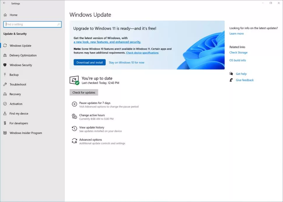
Windows 11 is now generally available as an update for eligible Windows 10 PCs. Microsoft is taking a measured and phased approach to the rollout, however, meaning not everybody will be offered the update immediately. When your PC is ready, a big popup will appear in Windows Update that will allow you to initiate the download and install process, and Windows will do the rest.
Your PC must meet the following requirements to be eligible for the Windows 11 upgrade:
- A compatible CPU(opens in new tab)
- At least 4GB of RAM
- At least 64GB of storage
- UEFI, Secure Boot, & TPM 2.0 enabled
Windows 11 is also available on new PCs starting October 5 2021. Most PCs going forward will ship with Windows 11 out of box from this date, though some OEMs will likely continue to offer SKUs with Windows 10 for the foreseeable future.
Be sure to check out our list of best Windows 11 PCs if you’re interested in seeing what new PCs are ready for Windows 11.
WINDOWS 11: WHAT’S NEW
Windows 11 focuses on three key areas: a fresh and modern UX designed to make using Windows simpler, new features and tweaks built around making you more productive, and a renewed focus on the Microsoft Store.
Most of the top-level user interfaces have been updated with a fresh look with new animations, iconography, and sounds. Everything from the Start menu and Taskbar right down to the context menus and in-box apps have been updated to look more consistent with the rest of the new Windows 11 design.
One of Microsoft’s goals with Windows 11 has been to declutter and simplify the user experience (UX) where possible. Microsoft is trying to make the Windows UX easier to use for casual PC users who may be more familiar with modern OS experiences such as iOS and Android, but this comes at the cost of simplifying some common features or behaviors that some old-school Windows die-hards may struggle to adapt to.
The good news is, for those who prefer simplicity over complexity, Windows 11 is going to be a great release for you. It’s an absolute joy to use, with a fluid UX that is almost perfect. Windows 11 is a breath of fresh air for those who enjoy the spectacle of software design, and a great release for those who value productivity enhancements and “getting to work” over everything else.
WINDOWS 11: FIRST THINGS TO DO
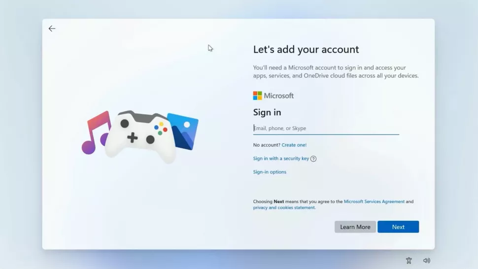
Windows 11 has a brand new out-of-box experience, which walks you through setup. Gone is the old Cortana-driven installer, and in its place is a clean and simplistic design that takes you through setting up Windows 11 with ease. That said, Microsoft has made some policy changes here that you need to know about.
For the first time, Microsoft is making it mandatory for PCs with Windows 11 Home to be signed in with a Microsoft Account and connected to Wi-Fi during the out-of-box experience. I don’t find this to be much of a big deal, as I actually like the integration and benefits you get with signing into a Microsoft Account. However, I know there are many people out there who refuse to use one, and this is going to be a problem for those people.
Once you’re up and running on Windows 11, the first thing you need to do is head to the Microsoft Store app and check for updates to ensure that you have the latest versions of all the pre-installed Windows 11 apps. Once that’s done, you should also head to Windows Update in the new Settings app and check for updates there to ensure you have the latest drivers designed for Windows 11.
The Review
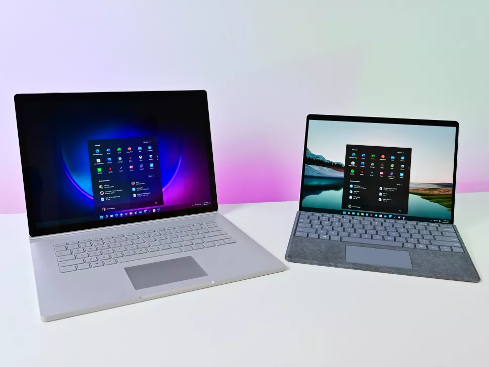
WINDOWS 11: START MENU
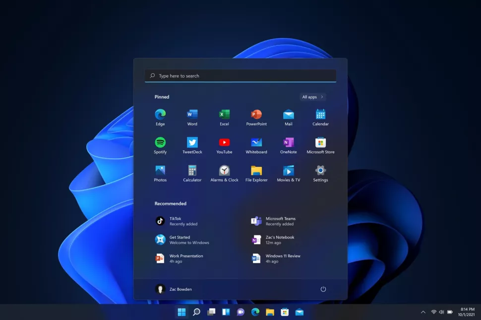
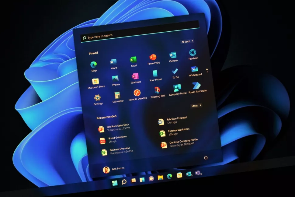
Windows 11 introduces new interfaces in almost every area of the desktop experience, and that includes the Start menu. Start has been a staple part of the Windows user experience for decades, so it’s always a big deal when it changes significantly, as it has on Windows 11. Now, this isn’t a “Windows 8-level” change, but it’s still going to take some getting used to.
The new Start menu has taken the simplistic approach to doing an app launcher. No longer is the Start menu home to a completely customizable layout of app tiles; it’s now a grid of icons that you can pin, unpin, and reorganize, and that’s pretty much it. Live tiles are gone, with apps now displaying a static app icon and its name beneath it. This is basically exactly how other modern OSes do things these days, so it’s no surprise to see Windows joining the fray.
The Start menu offers three rows of six icons that you can have pinned, with the ability to scroll through “pages” if you have more apps that you need to pin. There’s also a full apps list that shows you all your installed apps that can be accessed via the “all apps” button located just above your pinned apps.
Along the top of the Start menu is a search bar, which really only acts as a shortcut to the dedicated Search function you can access via the search icon on your Taskbar. Search and Start are still split up on Windows 11, which is fine, but not my favorite way of doing things. There’s a very clear disjointed experience when opening Start and beginning to type, as there’s no animation involved when switching between the two interfaces.
Below your pinned apps is a new “Recommended” area that acts as a recents menu for things like documents and installed apps. Whenever you install a new app or open an Office document, it will appear directly in this Recommended area for quick access. It’s very handy, but I’ve found it becomes cluttered very quickly as it has no filter controls at all. That means any documents, whether they be photos, Word documents, Excel spreadsheets, or even random files in some cases, can show up there.
I’d love to see filter options become available in the future. For example, I’d love to be able to set how long certain file types actually show up in the Recommended area as a recent file, or filter out certain file types altogether. I rarely, if ever, use Excel, so if I’m opening an Excel spreadsheet, I already know I’m probably not going to need to access it again. Being able to hide Excel file types from the Recommended feed, in this case, would be good, too.
Additionally, you can’t disable the Recommended area if it’s something you know you’re not going to use. Even if you clear it and turn the feature “off,” a big empty space that cannot be collapsed or hidden will remain. This makes the whole UX look a little silly, as you can’t use that extra space to show more pinned apps if that’s something you’d want to do.
WINDOWS 11: TASKBAR AND ACTION CENTER
A big area of change on Windows 11 is with the new Taskbar, which has essentially been rebuilt from the ground up with simplicity at its core. You’ll immediately notice that Microsoft has changed the layout of the Taskbar so system buttons and pinned or running apps are centered. This is a big change to the Taskbar, which has always been left-aligned.
I would’ve thought this change would take a long time to get used to, but I adjusted to it almost instantly. In fact, I really like the new Taskbar layout, and after just a few hours of using Windows 11, came to prefer my icons being centered. They feel more immediately accessible, and I no longer have to turn my head all the way into the corner on my massive ultrawide monitor. Things just look cleaner, which is a big deal for me personally.
All of the system icons (those being Start, Task View, Search, Teams Chat, and Widgets) have cute little animations that play when you click on them. And your pinned or running apps also have subtle pulse animations that play when you click on them. These small animations go a really long way to making Windows 11 feel like a fluid experience, which is leaps and bounds over the user experience on Windows 10.
As of February 2022, Microsoft has updated the entry-point for the Widgets feature. Once setup, the Widgets button will shift over to the far left of the Taskbar where the old Start button used to be, and will present up to date weather information directly on the Taskbar. This is a really nice feature, even if you don’t use the Widgets panel much. Being able to see the weather as glancable info directly on the Taskbar is a nice addition.
There’s also a couple of new behaviors for Microsoft Teams users. When in a call, you can now present an app window directly when hovering over an open app icon on the Taskbar, and you can also mute and unmute your microphone directly from the Taskbar. Microsoft says these features are available to other communication apps, as long as developers update their apps to support these additional Taskbar features.

Microsoft has done everything it can to simplify the Taskbar UX to the point in which it might be somewhat problematic for long-time Windows users. For example, you can no longer configure the Taskbar to appear on the left, right, or top of your display. There are also no additional Taskbar options in the right-click menu, with everything now moving into the new Settings app.
Microsoft has also removed common functions that even I’ve struggled with in my daily workflow. On every version of Windows prior, you’ve been able to drag a file into an app icon on the taskbar to drop it into that app, but that feature is gone on Windows 11. Without it, multitasking becomes a little trickier. The Taskbar is also worse if you use multiple monitors, too, as things like the date and time no longer show up on your other displays, only the main one.
While I really like the new design of the Taskbar, the functionality of it has certainly taken a step back on Windows 11. If you’re the kind of person who never really touched the Taskbar outside of clicking it to launch apps, you won’t have any problems here. However, if you’re used to utilizing some of the Taskbar’s more advanced features on Windows 10, such as toolbars, multitasking shortcuts, and more, most of those are gone now on Windows 11.
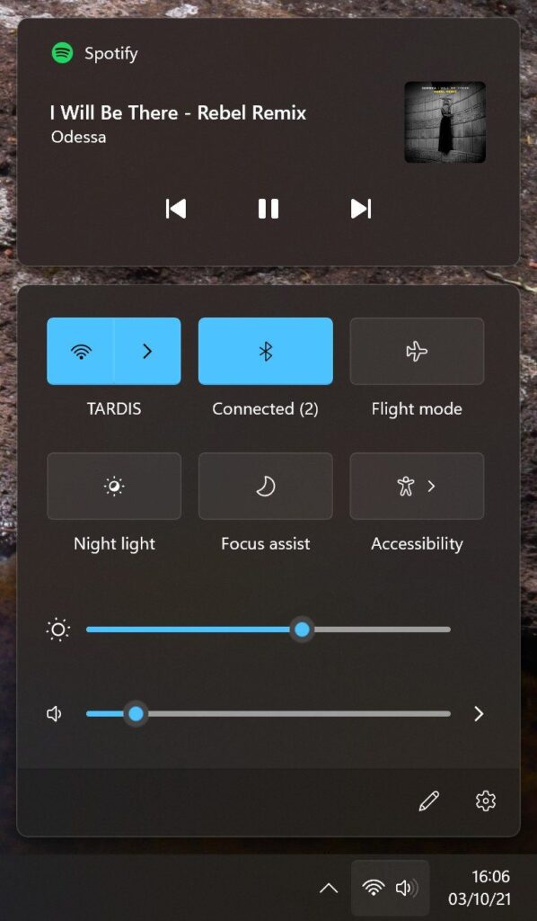
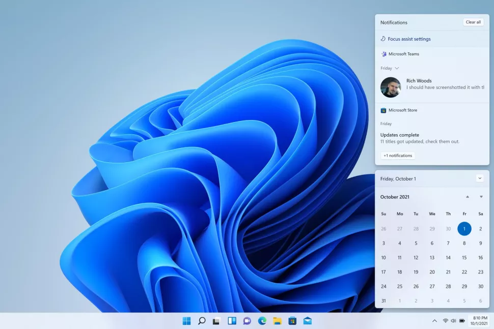
Elsewhere, the System Tray has been re-done on Windows 11 in an attempt to simplify it as much as possible. Microsoft has split up the Action Center into two separate flyouts: one for notifications and the other for quick settings. Clicking on the date and time button will open up your calendar view and notifications, and clicking on either Wi-Fi, Volume, or Battery will open the new Quick Settings panel.
I really like this new Quick Settings panel, as you can now configure things like Wi-Fi without being sent into the Settings app first. Some of the toggles have additional menus that let you configure them directly within the Quick Settings panel, which keeps you in your flow and doesn’t get in the way of your currently open app. That said, not all of the toggles can be configured directly from the Quick Settings panel, such as Bluetooth, which still takes you to the main Settings app.
I do like how this implementation reduces the amount of flyouts that come straight from the Taskbar. Having all these options in one panel makes the UX feel much less cluttered and convoluted, which is the whole point of Windows 11.
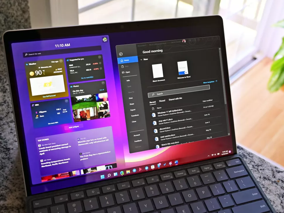
WINDOWS 11: WIDGETS
A new feature that Microsoft is trying to push on Windows 11 is “Widgets,” which exists as a hidden panel that flies out above your desktop from the left side of the screen. There’s a dedicated button for it on the Taskbar, or you can access it by swiping in from the left edge of your display. The panel consists of a widgets area at the top that has a handful of customizable widgets to choose from, and your Microsoft Start news feed below it.
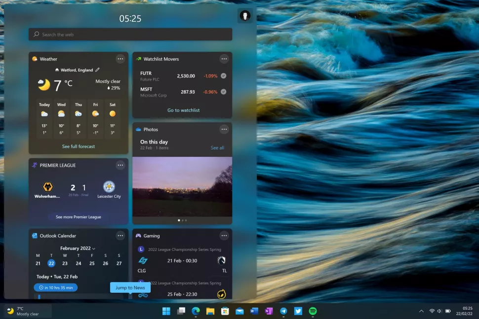
As of February 2022, Microsoft has updated this feature with a new entry point on the Taskbar. As mentioned above, It’s now accessible via a “weather” button placed in the far left of the Taskbar where the Start button used to be. This button will present you with the current weather condition, and clicking it will open up the full Widgets panel for access to all of the Widgets that are available to you.
I’ve not found this Widgets panel itself to be all that useful in my day-to-day workflow. The idea is that the Widget panel is always available to you for at a glance info, but I often forget it even exists, partly because I have no use for most of the widgets, and because the panel itself often has to first reload after not being opened for a few hours. Here’s a full list of the available widgets in this first release of Windows 11:
- Weather
- Photos
- To Do
- Calendar
- Sports
- Family Safety
- Watchlist (Stocks)
- Tips
Of all the widgets present, the Weather widget is the one I’ve found most useful. The Photos widget is nice, but it’s not something that makes me want to open the widgets panel to begin with. I’m also not a huge fan of how the widgets panel will force you into Microsoft Edge at any given opportunity.
Clicking on a widget or news article doesn’t open that content inside the widget panel. It instead closes the widget panel and opens Microsoft Edge. This makes the UX feel really disjointed and jarring, as it throws you out of one UI and into another just to bring you an extended weather view. What’s worse is that you can’t even configure the widgets panel to open in a browser of your choice; it’s Edge and that’s it. This is a really lame choice on Microsoft’s part.
Overall, I am not a fan of Widgets on Windows 11. This is one of those things I think you’ll check out for five minutes, and then never use again. The introduction of the weather button in the far left of the Taskbar is a nice addition, but it’s not going to make me use the Widgets panel itself any more. Weather on the Taskbar is the most I need, and I’ll never need to click on it unless the Widgets feature as a whole improves.
WINDOWS 11: SNAP ASSIST AND TASK VIEW
One area that Microsoft has focused a lot of effort on is the multitasking and productivity aspect of Windows 11, which has seen lots of great improvements that almost make upgrading to Windows 11 worth it on their own. We’ll begin with improvements to Snap Assist, which builds upon the classic Aero Snap feature first introduced with Windows 7.
In addition to being able to drag an app to the left or right of your display to snap it side-by-side, you can now hover over the maximize button with your cursor to see a drop down of all the different snap layouts available to you. This makes it super easy to snap two or more apps without needing to move your mouse to the very edge of your display, which is great if you’re using a large display such as an ultrawide.
Speaking of big displays, Microsoft has also added new snap layouts that take advantage of bigger screens. There are now new snapping grids for three apps in a row, which makes much better use of that extra screen real estate. All of the fluid animations present here make using Snap Assist on Windows 11 a complete joy to use. This entire UX feels excellent, and I think it’s one of Windows 11’s highlight features.
For tablet users, Snap Assist will now intelligently snap apps above and below when using a device in portrait mode, a behavior that was missing in prior versions of Windows. Microsoft has also updated the switching orientation animation so that it’s much more fluid, and also remembers where your apps were positioned when switching between landscape and portrait mode.
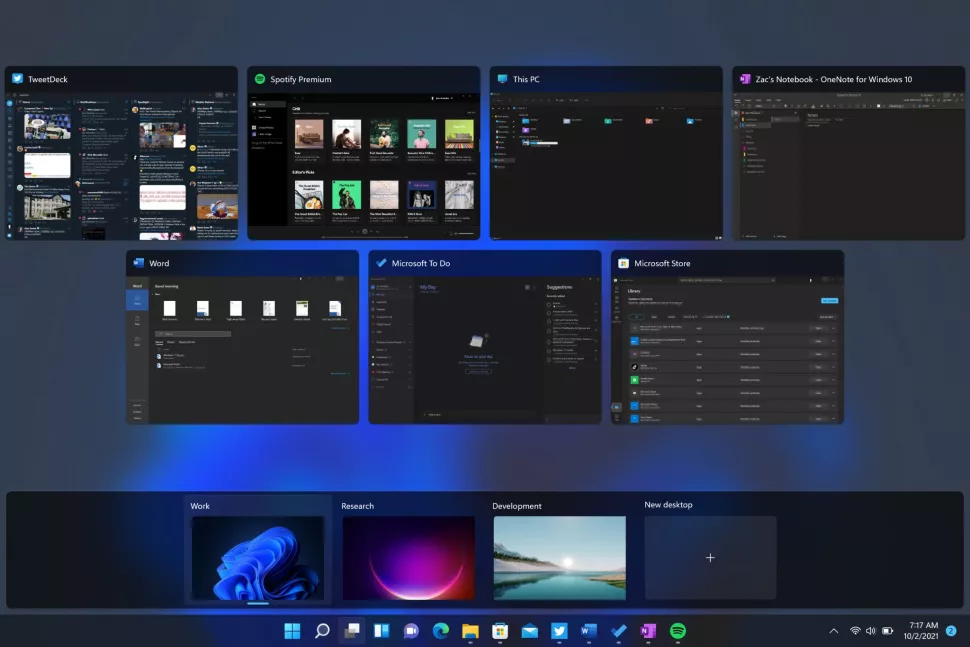
There are also made several key changes and improvements to the Task View UI, which is where many go to see an overview of all their running apps. On Windows 11, Microsoft has removed the old Timeline feature, instead prioritizing your open apps and Virtual Desktops, which now appear along the bottom of your display. Virtual Desktops are much more customizable now, with abilities such as renaming and even setting custom wallpapers for each desktop.
You can also reorganize your desktops by clicking and dragging, and they’ll even persist across reboots meaning you can really set up your PC so that you have a different virtual desktop for each of your workflows. For example, I have one for working and one for gaming. I still think there’s room for improvement here, however. I’d like to be able to customize pinned apps on the Taskbar and in Start separately across virtual desktops. Right now, that’s not possible.
WINDOWS 11: TOUCH AND PEN
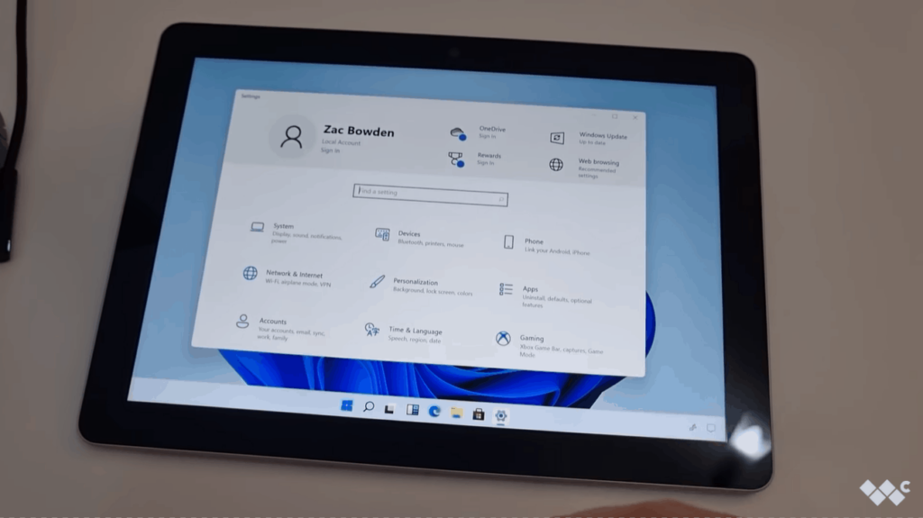
Microsoft has made several key improvements, and one notable regression, to the touch-first experience on Windows 11. Overall, I’d say Windows 11 is a much better experience when used on tablets and with a pen, but it comes at the cost of a dedicated “tablet mode” that automatically opens apps full screen like you’d expect on an 11-inch tablet.
Windows 10’s tablet mode is gone, and in its place are a number of improvements to the desktop UX designed to make using Windows with touch a more pleasant experience. I still wouldn’t recommend a Windows tablet, but Windows on a 2-in-1 is in a much better position today. For example, Microsoft has added new gestures that can be initiated with either three or four finger swipes.
- Three or four finger swipe down to minimize an app
- Three or four finger swipe left or right to switch apps
- Three or four finger swipe up to access Task View
- Four finger tap, hold, and swipe left or right to switch virtual desktops
There are also improvements to window management, with new subtle animations in place that make it easier to determine when you’ve successfully grabbed an app window with your finger to manipulate it. Microsoft has also increased the size of hitboxes around app windows so that they are easier to resize with touch as well. Windows will also automatically increase the spacing of touch targets on the Taskbar and place a button for the touch keyboard in the System Tray too.
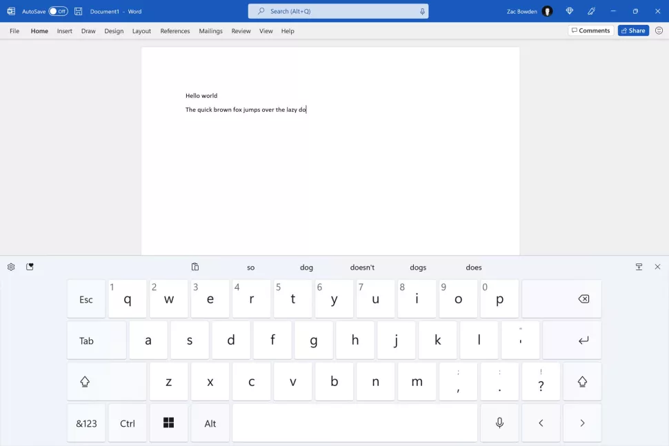
On that subject, a new touch keyboard experience is present on Windows 11, and I think it’s the star of the show for tablet users. It’s a fantastic touch keyboard, complete with satisfying sounds, subtle animations, and accurate spelling correction thanks to SwiftKey being what powers it behind the scenes.
There’s a number of different sizes for it, including split view, a one-handed mode, a simplified full width layout, and a more advanced full width layout for devices with larger display sizes. You can also swipe type, and there’s a new emoji panel along the top that you can access for quick entering of your favorite emojis, gifs, and other media content.
For pen users, there’s much to enjoy as well. Microsoft has finally updated the Windows Ink Workspace, now called the “Pen menu” that gives you quick access to pinned apps that are designed with inking in mind. What’s great is that it’s finally customizable, so you can put any app of your choice in there. I’ve got OneNote, Paint, and Adobe Photoshop in mine. It’s accessible via a button shortcut on a physical pen, or via the System Tray as a shortcut for it pops up when you begin interacting with your device with a pen.
You can now ink directly into text boxes, another great feature if you primarily use your device with a pen. No longer do you have to switch between inking and tapping on the screen to insert some text into a search field, as Windows will now automatically pop up a handwriting panel for you to use when tapping on that text field with a pen.
Much of these improvements are really nice and put the Windows touch UX more in line with other modern touch-first OSes, but it’s still not perfect. Not being able to have apps automatically open full screen is killer for a tablet UX, especially on smaller displays like the Surface Go. It’s annoying having to manually full screen every app you open for the first time.
WINDOWS 11: ANDROID APPS
As of February 2022, Microsoft has started rolling out Android app support on Windows 11, albeit in “preview” and in the United States only. Android apps on Windows 11 are an interesting idea, more so thanks to how Microsoft has decided to go about providing Android apps to users. Instead of allowing app developers to submit Android apps to the Microsoft Store, Microsoft has partnered with Amazon to deliver the “Amazon Appstore” on Windows 11 instead.
That, frankly, kind of sucks. The Amazon Appstore is probably the worst Android app store out there as it has no apps, yet it’s now the default storefront for Android apps on Windows 11. The Microsoft Store will display Android apps, but attempting to install them will first require the Amazon Appstore to be downloaded and installed. It’s a real shame, and creates a disjointed user experience.
In my time using Android apps on Windows 11, I’ve come across one or two apps that people might actually want to use. Kindle is the standout, as it’s the only good Kindle reading experience now, but everything else is either a rubbish mobile game or something that you can already do on Windows without requiring an Android app.
All of the Android apps I would want to use, including things like controlling my smart lights and appliances, checking my bank statements, unlocking my car, all aren’t available on the Amazon Appstore. Now, it’s worth noting that you can sideload Android apps, which will bypass the Amazon Appstore and let you install basically any Android app you like, but this isn’t a trivial task and I don’t expect most consumers to do this.
Regardless of the app situation, the actual emulation of Android apps works surprisingly well. I’ve tested a few games and apps, and all run as if they were performing natively on my device without having to run Android in the background. There’s a short load time of about 5-10 seconds when loading up your first Android app, but once that’s done, launching subsequent Android apps will launch basically instantly.
That said, the ability to run Android apps does require a but of power under the hood. Not every PC will be able to run these apps, as the overhead required is significant. Microsoft recommends 8GB RAM at least, but says you’ll have a better experience with 16GB RAM, which I agree with. The Android subsystem is heavy, frequently eating up 2GB+ of RAM, more if you have multiple Android apps running at a time.
Overall, I don’t think I’m the target demographic for Android apps on Windows 11. It’s great that it’s here as an option, and it works surprisingly well for what it is, but I really wish Microsoft had just gone on its own and allowed developers to submit their Android apps directly to the Microsoft Store, instead of relying on the Amazon Appstore to handle it for them.
Windows 11: Should you wait?
Windows 11 is what you’d call a “version 1.0” product, which means it’s just getting started, and while there’s lots of great things here, there’s also a lot missing (especially around the Taskbar) that long-time Windows users may struggle with. Microsoft has achieved its goal of trying to simplify the top-level Windows UX, but at the cost of functionality which many consider essential to their workflows.
If you’ve read this review and not considered any of the problems mentioned to be a deal-breaker, I think Windows 11 is going to be great for you. It’s not slow, unstable, or buggy in my usage. It feels ready for production use, and I’ve enjoyed every minute of using this OS. I’m never going back to Windows 10.
However, if you usually have your Taskbar at the top of your display, or don’t like the sound of having to click a few extra times to access a function that was previously available in a single click, then Windows 11 is not going to be for you at this moment. Windows 11 prioritizes simplicity, sometimes at the cost of burying functionality behind menus or inside the Settings app.
WINDOWS 11: THE BOTTOM LINE
I really like Windows 11. It’s a breath of fresh air for Windows that attempts to throw out much of the old UX in favor of a more modern, fluid, and simplistic interface. I think it does a good job at achieving this goal, though it’s not perfect. Power users and long-time Windows users will need to relearn some habits and get used to missing functionality in some areas.
I’m sure Microsoft will add back some of the missing features and behaviors in future releases, but I don’t think it’ll add back everything. I have a feeling that the vision for Windows 11 going forward is simplicity and ease of use, catering more to the average user who is more familiar with how things are done on their phone, and less to the die-hard Windows power users who want everything to be accessible in a single-click.
If you are okay with that, Windows 11 is great. If you aren’t, then hanging onto Windows 10 for another year is going to be your best bet. Windows 10 is supported until 2025, so there’s no immediate rush to upgrade. In a year, or even two years, Windows 11 will be in a much more “complete” state, and that’s when it might be worth giving another try.
Windows 11 has the potential to be the best version of Windows yet, but some of the choices Microsoft has made around Teams Chat, Widgets, setting browser defaults, the incomplete dark mode, and functionality of the taskbar really hold it back from being that. Hopefully the next release of Windows 11 fixes these issues.
-
販売中の商品
 Windows 11 Pro と Office 2019 Pro Plus のセット商品元の価格は 5,997円 でした。4,977円現在の価格は 4,977円 です。
 -
販売中の商品
 Windows 11 Professional Retail元の価格は 28,380円 でした。3,850円現在の価格は 3,850円 です。
 -
販売中の商品
 Windows 11 Home元の価格は 19,360円 でした。1,950円現在の価格は 1,950円 です。
 -
販売中の商品
 Windows 11 Professional元の価格は 28,380円 でした。1,950円現在の価格は 1,950円 です。